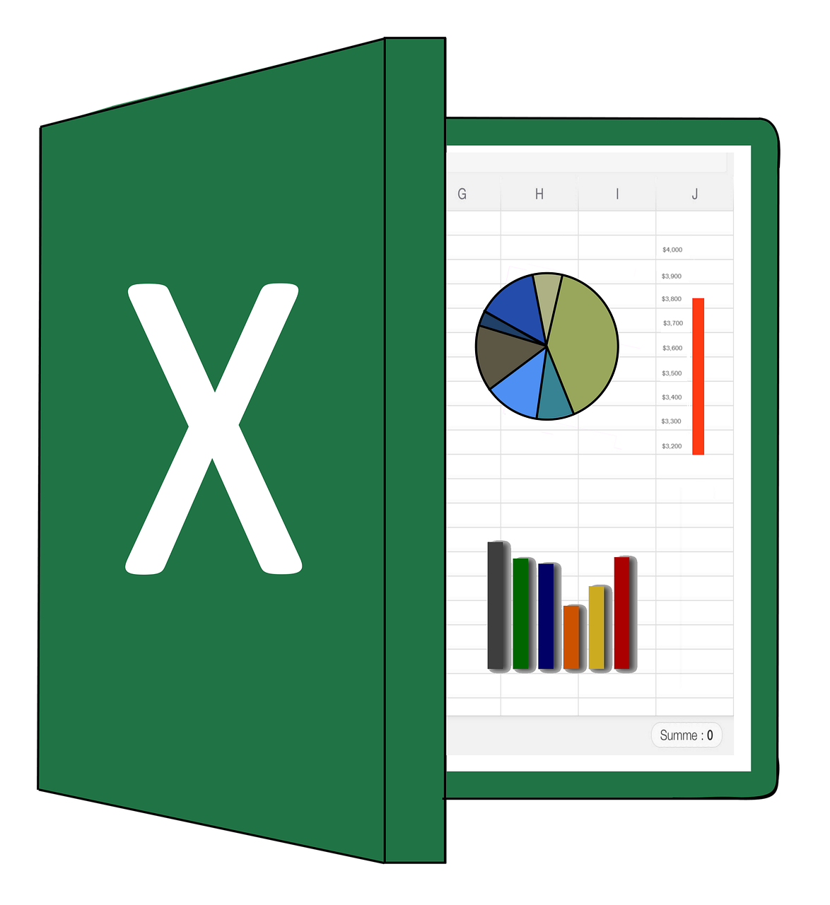
Learn the Basics of MS Excel Charts

  • No Rating
  • (0 Reviews)
  • 0 students enrolled

Learn the Basics of MS Excel Charts

Learning the basics of MS Excel and Excel charts and graphs is essential for several reasons. Firstly, Excel is a fundamental tool used across industries for data organization, analysis, and visualization. Proficiency in Excel enhances efficiency in tasks such as budgeting, forecasting, and data manipulation, making it a valuable skill in various professions. Understanding Excel charts and graphs allows individuals to effectively communicate data insights visually. Charts and graphs transform complex datasets into easily understandable visuals, aiding in decision-making and presenting findings to stakeholders. Whether representing trends over time, comparing data sets, or illustrating proportions, Excel charts provide clarity and context to information. Moreover, Excel proficiency is highly sought after in the job market, with many roles requiring familiarity with spreadsheet software. By mastering Excel basics and charting techniques, individuals increase their employability and open doors to a wide range of career opportunities. Overall, learning MS Excel and Excel charts and graphs equips individuals with indispensable skills for professional success in today's data-driven world.

  • No Rating
  • (0 Reviews)
  • 0 students enrolled
  • $29.00
  • $59.00
0-Day Money-Back Guarantee


What learn

  • In an Excel chart and graph course, you'll learn to select, create, customize, and interpret various chart types, enhanc...

Course Content

5 sections • 5 lectures • 00h 47m total length
Learn the Basics of MS Excel Charts
Before we dive into the details of Charts and Graphs in MS Excel, let's learn basics of MS Excel Charts.
8min
Learn 2D Area Chart of MS Excel
Discover the power of visual data representation with our comprehensive guide to mastering 2D Area Charts in Microsoft Excel. Ideal for beginners and seasoned professionals alike, this tutorial empowers you to transform raw data into compelling visual stories. Learn to create 2D Area Charts, a vital tool for showcasing trends over time, comparing multiple data series, and highlighting the magnitude of change between different data points. Our step-by-step guide walks you through the process of selecting your data, navigating Excel's menu to insert your chart, and customizing it to suit your presentation needs. Whether you're aiming to illustrate stock market trends, weather changes, or sales data over time, this tutorial equips you with the knowledge to do so efficiently and effectively. Unlock the potential of Excel's design features to make your chart stand out. From adjusting color schemes and adding chart titles to tweaking axis labels and gridlines, you'll learn how to tailor every aspect of your chart for maximum impact. By the end of this guide, you'll not only have mastered the art of creating 2D Area Charts but also gained the confidence to explore Excel's vast array of charting options to better inform and persuade your audience.
14min
Learn Doughnut Chart in MS Excel
Embark on a journey to elevate your data visualization skills with our comprehensive tutorial on mastering Doughnut Charts in Microsoft Excel. Whether you're a beginner or an Excel aficionado, this guide equips you with the tools and knowledge to create compelling Doughnut Charts that effectively communicate your data insights. Discover the versatility of Doughnut Charts as a visual representation tool, perfect for showcasing the composition of a whole while highlighting individual components within it. From budget allocations to market share percentages, this chart type offers a visually appealing way to present complex data sets with clarity and precision. Our step-by-step instructions guide you through the process of selecting your data, inserting the Doughnut Chart, and customizing it to suit your specific needs. Learn how to adjust colors, labels, and formatting to create a polished and professional-looking chart that captures your audience's attention. Unlock the full potential of Excel's design features to enhance your Doughnut Chart further. From adding data labels and legends to exploring advanced formatting options, you'll gain the skills and confidence to create impactful visualizations that effectively convey your message. By the end of this tutorial, you'll have the expertise to leverage Doughnut Charts as a powerful tool in your data analysis arsenal, enabling you to present insights with clarity and flair, ultimately empowering better decision-making and understanding.
6min
How to Create Sparklines from your Data in MS Excel
Learn to create Sparklines from your data in Excel to show trends in a series of values such as increase/decrease, economic cycle or to show maximum and minimum value of your data. Remember to position your Sparklines near your data as they are tiny charts and it will have major effect.
9min
Learn How to Create Line Charts in MS Excel
A Line Chart in Excel is a visual representation of data points connected by straight lines. It is ideal for showing trends over time or comparing multiple data series. Benefits include easy identification of patterns, highlighting trends, and facilitating data-driven decision-making through clear visualization of relationships and fluctuations.
10min

Requirements

  • A computer/laptop with good internet connection, working version of Excel 2016 preferred; even trial version will do. Some basic idea of Excel like opening/saving excel sheets etc are desirable.

Description

Welcome to Excel Charts and Graphs Mastery, an online course designed to equip you with the essential skills needed to create compelling and insightful visualizations using Microsoft Excel. If you're a beginner seeking to enhance your data presentation abilities, this course offers a comprehensive and structured learning experience.

Throughout this course, you will embark on a journey that covers the fundamentals of data visualization, exploring various chart types, customization options, and best practices for effective communication of insights. With a combination of video tutorials, hands-on exercises, and real-world examples, you'll gain practical knowledge and confidence in leveraging Excel's powerful charting capabilities.

This course is a paid course as we will dive much deeper to learn new skills. It is much more different than the free Excel course even though this course is built over the free one. There are more chapters and more topics are covered in this paid course. Hope you like it!

Recent Courses

blog
  • March, 23rd 2024
  • 0

Learning the basics of MS Excel and Excel charts and graphs is essential for several reasons. Firstly, Excel is a fundamental..

  • $29.00
  • $59.00
blog
  • February, 17th 2024
  • 0

Learn the Basics of MS Excel Charts

  • Free
blog
  • February, 17th 2024
  • 0

Learn to play chess from an Expert chess coach.

  • $29.00

About Instructor

instructor
About Instructor